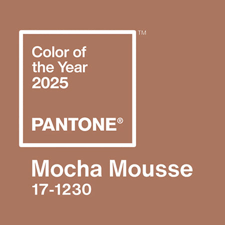
The time has come for our rundown of this year's PANTONE 2025 Color of the Year! Last week, the Pantone Color Institute announced it's selection for the upcoming year's featured color: PANTONE 17-1230 Mocha Mousse - a hue which alludes to "a global mood of connection, comfort, and harmony."
Every year, the Pantone Color Institute selects a color as part of their Pantone Color of the Year program. Their selection aims to encapsulate the current global cultural climate as we transition into the new year - spanning across industrial trends and the overarching mood worldwide.

This year's selection, Mocha Mousse, is "a warming, brown hue imbued with richness," the Institute says. "It nurtures us with its suggestion of the delectable qualities of chocolate and coffee, answering our desire for comfort." Their description of the color goes on to explain that, "With its sophisticated, earthy elegance, PANTONE 17-1230 Mocha Mousse can stand alone or serve as a versatile foundation, enhancing a wide range of palettes and applications—from minimalist to richly detailed designs—across all colour-focused industries."
In a statement about the color choice, the Pantone Color Institute's Executive Director Leatrice Eiseman described it as, "Sophisticated and lush, yet at the same time an unpretentious classic."
To celebrate the announcement, the Institute has again partnered with brands including Motorola, Spoonflower, Ipsy, Pura, and more to incorporate the color into new featured products including phones, makeup, and textiles. Read all about these various partnerships and more on Pantone's 2025 Color of the Year page.

The choice of a warm brown for 2025 feels in-line with the trend toward neutral palettes that has taken hold in the past several years. In 2024 we saw a rise in light neutrals and muted earth tones in everything from jogger sets to home decor - something the internet-labeled "Sad Beige Moms" embraced in full force. But while Sad Beige Moms take a bit of criticism for sticking to monotonous, boring aesthetic choices, the Pantone Institute's selection is a solid reminder of why neutrals are anything but boring. Who looks at a warm cup of coffee, a luxe chocolate dessert, or natural wood accent furniture and feels anything but pure comfort? So as usual, we have to say this color is spot on for a time when we all might be feeling a little nostalgia for simpler times - a manifestation and full embrace of little pleasures that are at once soft, cozy, and familiar. And as far as artwork goes? We're happy leaning into woodsy landscapes, warm-toned pottery, pet portraits and earthy abstracts. If that's the vibe in 2025, it's going to be a very Happy New Year.
This year, we've curated an entire collection of work that features warm brown tones similar to the PANTONE 2025 Color of the Year! Explore the collection here, or contact us to work with an Art Advisor on how to incorporate this lush hue into your art collection or home design today.


0 comments
Post a comment