
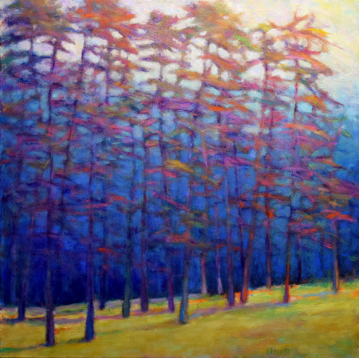
Warm Contrasts and Cool Blues - Original Painting
Description
Dimensions
Authentication
Shipping and Returns
Notes From The Artist
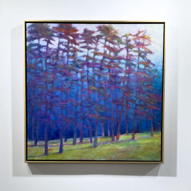
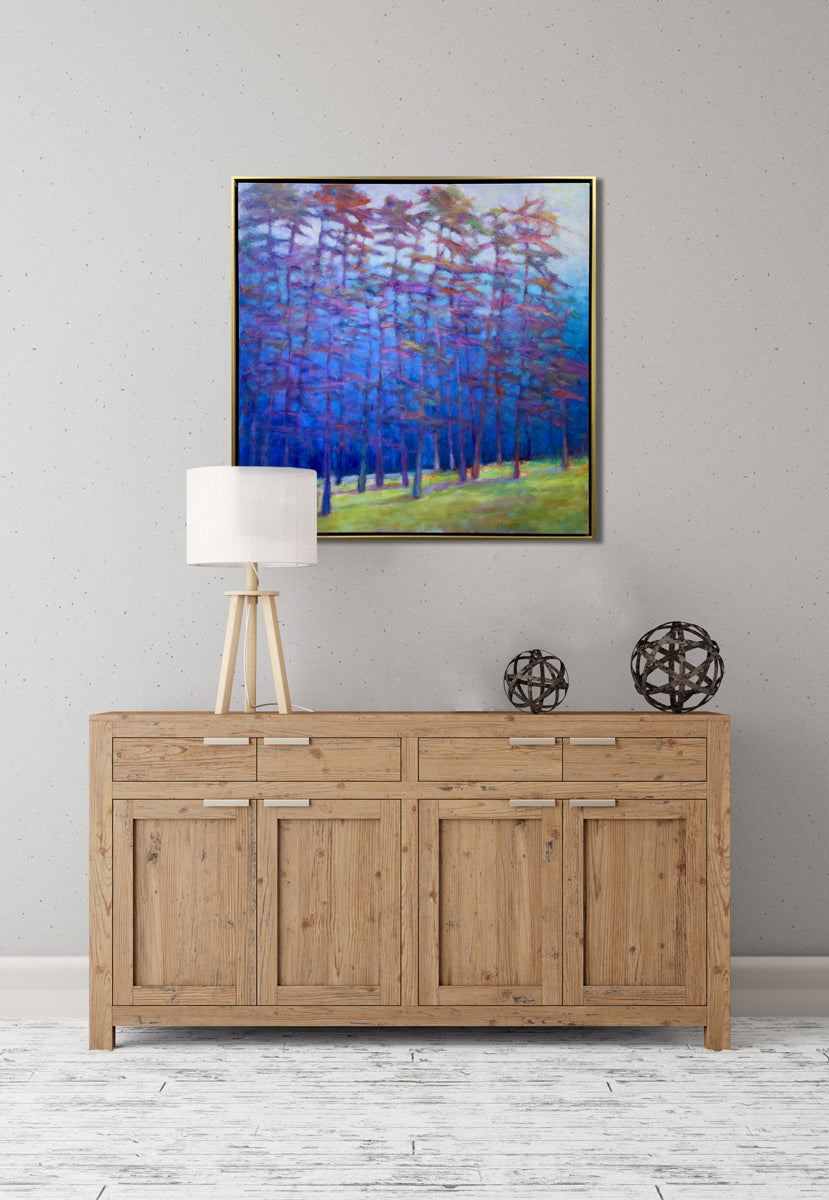
"This oil is of an oft-used and imaginary place of mine that is full of detail. I like to look at the wider landscapes that are in abundance and take a small slice of that view, creating an oil like this one that focuses on the many subtleties to make it interesting and believable.
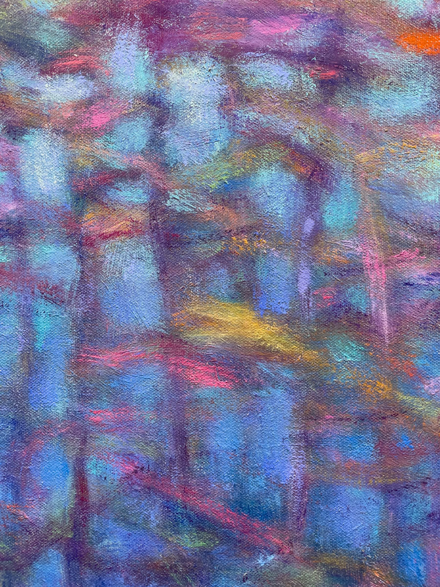
"For the focused areas, it’s very important to be mindful of those details… what is occurring at the edges of things, the compositional arrangement and then there is the color.
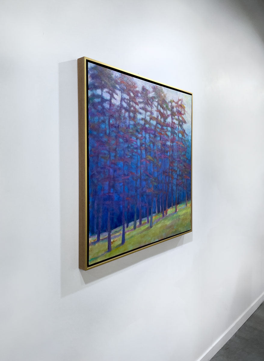
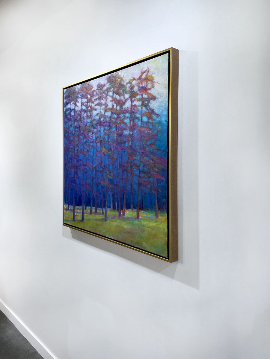
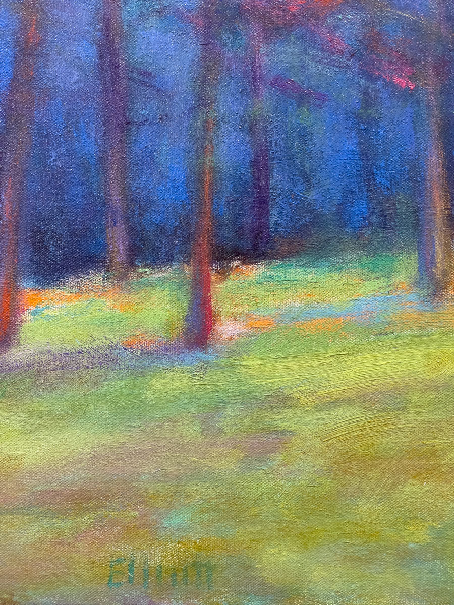
"From the start, I set out to do a cool line of trees with a bright foreground. A number of combinations were tried out but I finally began to settle on blues and yellows, but with a twist. By adding high-contrast darks at the boundary line, the blues and yellows became even brighter. Everything else, the trees, hills and sky would be a softer tone and focus, all secondary to the brighter blues and yellows.
"The blue-aqua hills in the far back fade into the pale sky, complementing, but not distracting the power of the blue forest. The last, big compositional part would be the tall trees. I wanted something to happen that would be really colorful and spirited.
"Since I’m the one in charge, I declared those trees would be anything but green, resulting in the many-hued, warmer color arrangement. It took a number of painting sessions to get it right, but I enjoyed all of my time spent in this forest." - Ken Elliott

Choose options


What our customers say
These are general reviews for Sorelle Gallery and are not specific to this artwork.
Perfect for the space! You all are experts at printing, framing, and shipping.

Beautifully printed and framed, perfectly packaged, arrived timely, and just a fabulous print for our walls

We are over the moon with our new Jill Haas prints! They are the prefect pop of color for our daughter's home. Wonderful prints, wonderfully framed, quick turnaround on delivery, too. BTW, they were packed perfectly!
Fantastic reproduction print.

This piece looks fantastic in a small grouping we put together. I really love the colors and the open spaces in this painting.

Simply love it

Love the deep blue color

Very lively and amazing colors
Simply Beautiful !!!!

Gorgeous!!!!!!!

Our new Karin Olah piece is gorgeous - the incorporation of fabric adds dimension and interest that we love. Thank you so much!

Ordering from Sorelle Gallery was a pleasant experience. Staff was helpful, questions promptly answered, artwork arrived securely packaged.
Letting Go - Limited Edition Canvas Print is beautifully framed with a bold color palette and a big splash of white. It reminds me of an ocean wave, I love looking at it. Very happy with my purchase.

On a weekend stroll in Westport, I visited Sorelle gallery. It a welcoming environment to display works of art. Two artists caught my eye. Having a specific spot to place a piece, I looked at original works, but the originals didn’t fit. Exploring canvas prints gave me more options and I found one I love. It works in the room beautifully and brings me joy every day.

Anthem

I haven’t taken possession yet, it is in the artists show!
