

When it comes to artwork, interior design, or decorating, color can be one of the most challenging elements to navigate. It's easy to shy away from color, and ultimately create an almost entirely neutral space where artwork, furniture, walls and floors all seamlessly blend with one another. But that's precisely why we felt it necessary to make the case for color. It may require a bit of imagination and some experimentation here and there, but embracing more color can result in a mood-boosting expression of personality that's as unique as you are. So, what's so great about color and how to start? Let's begin with our four tips for embracing a more vibrant aesthetic in your home and art collection.
1. A couple of colors can be enough.
While we love ultra-colorful, eclectic spaces, so much color is not necessarily for everyone and can feel overwhelming to some. The good news is, though, that injecting just a couple of colors into a room can often be enough. The goal with color is to add visual variation, personality, and life to a room. Adding even two colors can not only achieve said visual variation, but it can offset the monotony of neutral colors like grey or beige, and provide balance.
So, for those who are not necessarily ready to embark on a maximalist living space, how do you begin selecting colors? For some, it may be scary to venture into the bright and bold, while others may have a hard time narrowing it down. But we love singer Lily Allen's design trick (whose "weird and wonderful" Brooklyn townhome was featured in Architectural Digest in February of 2023) -- start with the carpet. Choose a carpet you like and "work your way up," she says, pulling colors from there to create a palette and inject them throughout the rest of the room. This can help make pieces in your space pop without compromising on cohesiveness. Then, when it comes time to select artwork or consider a new painting, the art can add that final bit of variety in a third or fourth color, or tie together the palette of the other colors you've already selected. Either way, it'll be like fitting that last puzzle piece into place.

2. Consistency isn't necessarily key.
As Art Advisors, we commonly see clients attempting to match colors within their living spaces perfectly. Very often, questions arise like, "Is the blue in this original painting too different from the teal in our throw pillows and curtains?" for example.
We want to ease those fears and assure anyone looking to add art to their space that consistency isn't always key! Some of our favorite color combinations are different shades or hues of a single color paired together, or even a wild mix of colors. Think about it this way: If you have an emerald green sofa, you wouldn't refrain from putting houseplants with healthy green leaves nearby because the two greens don't match, right? Conversely, have you ever thought, "that arrangement of flowers is too colorful for this room?" Probably not - because the colorful accent of flowers likely adds a cheerful liveliness to the space. Artwork works the same way with other elements of a room.
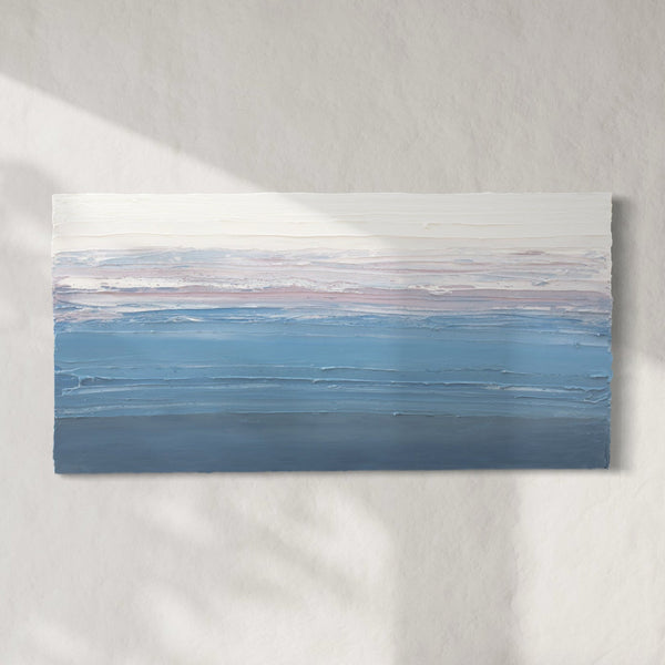
Some shade and hue combinations we love include varying blues with teal, pink with cranberry red, or mustard yellow with earthy brown. So even if you're working with a limited palette or just a couple of colors, don't be afraid to be flexible within that selection to add more depth to your overall aesthetic. Art can be comforting, but it can also serve to challenge in the best ways, so we encourage everyone to allow it to do just that. If you find a piece you like and catch yourself thinking, “but it isn’t the right shade,” consider leaning into that imperfection.

3. Contrast is eye-catching.
In color theory, it's the colors that are opposite one another on the color wheel that are considered "complementary." When paired together, complementary colors enhance one another's vibrancy, creating a highly eye-catching effect. It's the "opposites attract" of the art world.
So, what does this mean when it comes to artwork? You'll often find that artwork will incorporate contrasting colors for the reasons mentioned above, but that works within an interior just as well. If your room is primarily blue and white, blue's complement is orange. A vibrant orange painting surrounded by varying blue hues will add a dramatic effect to the space without overpowering it. The blues and oranges will each become subtly enhanced, the eye will be drawn in to the artwork before moving on to take in different features within the room, and overall, you'll have added a striking visual contrast to a space without going too big for comfort.
One tool we love is Canva's interactive color wheel. Simply click a color on the wheel and it will tell you its complement and other significant combinations based on color theory. This is a great resource if you decide to plan out your design, or to help make decisions along the way.

4. Color is a means of self expression.
We want to start here by saying that if your happiest palette is simply a minimalist white, that is perfect. But if you do like color, as you begin to experiment with integrating it into your space you might find you like it even more than you realized. Neutrals are comforting, peaceful, and therefore, safe, but there's a certain freedom that comes with experimenting with color. As you embark on selecting artwork or piecing together the design of a room, just don't forget that this process, too, is a mode of self expression. It's not so different from piecing together an outfit.
So when you begin to purchase art, or question color, we urge you to remember this: Let your personality shine in this space, because it's yours. And if you like it, that's all that matters.

Whether you're looking to start or expand your art collection, moving to a new home, or beginning a renovation, consider these tips for working with color. You may find yourself ready to make some bold decisions, ultimately creating a space and collection that is personal, vibrant, and genuine. Want to explore colorful artwork? Check out our Vivid Views Curated Collection, which features our most saturated and colorful original paintings, sculptures, and custom prints. Or, work with an Art Advisor to get custom recommendations.
What do you think of our tips? Let us know in the comments below.

0 comments
Post a comment