

Pantone's 2020 Color of the Year was announced last month and was significant not only to ring in the new year, but to set the tone as we ushered in a new decade. The color, 19-4052 Classic Blue, is evocative of "the sky at dusk," and chosen as a tranquil, dependable, reflective color that lays a "stable foundation on which to build as we cross the threshold into a new era," the Pantone Institute said.
Classic Blue is reminiscent of the Color of the Year selected for the year 2000 - Cerulean. Blue brings rest, peace, and clarity as we enter a new, significant, and unpredictable decade.
Leatrice Eiseman, Executive Director of the Pantone Color Institute said of the choice, "We are living in a time that requires trust and faith. It is this kind of constancy and confidence that is expressed by PANTONE 19-4052 Classic Blue, a solid and dependable blue hue we can always rely on. Imbued with a deep resonance, Classic Blue encourages us to look beyond the obvious to expand our thinking; challenging us to think more deeply, increase our perspective and open the flow of communication."
The Pantone Institute revealed the 2020 Color of the Year at an unveiling event in New York City last month, creating a fully immersive experience by incorporating Classic Blue into drinks, furniture, scents described in a CNN recap as "a contemplation of where sky and sea meet," and sounds as "vivid nostalgia."
So, we'd be remiss not to address the big question: how does one use the Color of the Year in 2020? As art advisors, it's an exciting choice because blue hues are excellent for a number of reasons. As the Pantone Institute explained, blue is known to be a calming presence in a space; this makes it ideal for bedrooms, bathrooms, or lounge spaces where the main focus is relaxation. But this particular blue hue is special in that it can really go anywhere as a complement to brighter, warmer colors, and be both grounding and elegant. Plus, while Pantone's selection does speak to the times, it is, well, classic, so anything in this hue is an investment that won't go out of style.
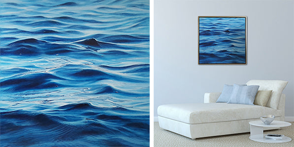
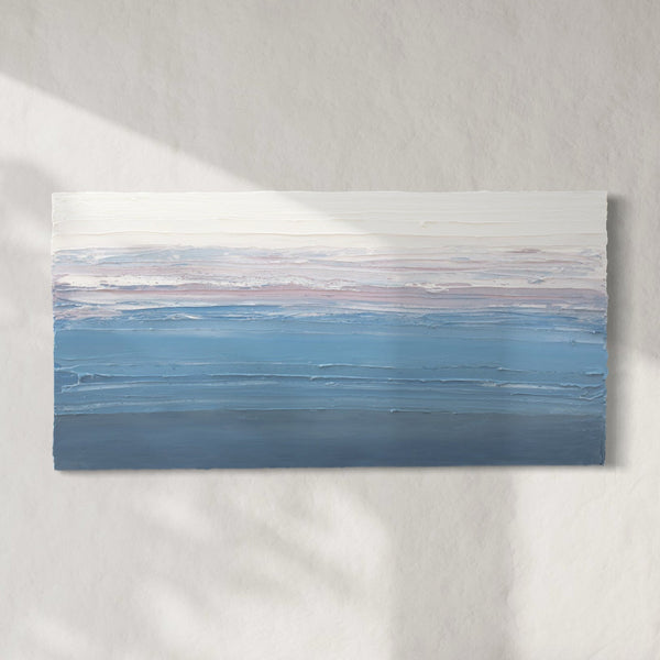
We've created a Blue Hue collection to celebrate the color, provide some inspiration, and assist you in adding artwork that transcends trends and last for decades to come. Click here to shop Blue Hues (like Transitions by Antonia Tyz Peeples, pictured above).
In case you missed it, last year the Pantone Color of the year was Living Coral. Sorelle collaborated with Tina Anastasia of Mark P. Finlay Interiors at the 2019 Kips Bay Decorator Showhouse in Palm Beach Florida, featuring artwork in the firm's coral and lavender cabana - just as the Color of the Year was released. Click here to read more.
0 comments
Post a comment